AirBnB Calls Design Generalists an “Underrated Superpower” /
AirBnB
Airbnb has penned an insightful study of design generalists, isolating 6 defining skillsets that make generalists an “underrated superpower” in the technology space. They are “Deeply strategic, evidence driven, strong storytellers, systems thinkers, highly collaborative, and more confident and adaptable designers,” writes AirBnB Design Lead Molly Nix.
On being adaptive:
“...quick at learning, unafraid to ask questions, and more importantly, [they came] to this space with a fresh lens, unbiased about the industry we were rethinking. ”
Read the full piece on AirBnB: https://airbnb.design/defining-design-generalists/
Channel Your Inner Designer Like Marie Kondo And Win At Anything /
How a tidy mystic design rebel won The West, and you can too
Marie Kondo isn’t a magician, she’s a designer. Designers, easily the most misunderstood of all artists, bring order to chaos in a fashion and style that channels their musings. The more fresh and unique the fashion and style of their designs, the more captivated an audience is by the designer.
Marie Kondo clearly loves what she does, and Westerners are amazed by this because they see her as someone who is enthralled by cleaning, not someone who enjoys designing. Embattled by politics, revolution, and material fatigue, Western societies need her contagious enthusiasm in their feed right now. Her style is immersive and joyous; her methods effective.
Designers are organizers, organizers are designers
Some people may be confused by this idea. “She’s not a designer, she’s an organizer!”
Again, Design: the most misunderstood art.
Design is the delicious crust surrounding the career pie chart. Designers get a slice containing typographers, decorators, architects, and experiential disciplines. Other arts have a slice for everything from musicians to mimes. Then, a slice where organizers and coordinators live; design is thriving there more than ever, thanks to Marie Kondo.
Poorly designed pie chart makes point about pie charts
Not everyone is a Designer, obviously. Other slices may not be professional designers, but design their trades nonetheless. Life requires we organize, coordinate, and strategize every day. Is design the ultimate survival skill? Ask The Three Little Pigs! The more a person adds design to their skill, the more their love for their skill shows.
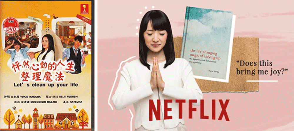
As is typically the case near the end of a decade, societies search for a new paradigm. Kondo’s original book “Jinsei ga Tokimeki Katazuke no Maho” came to attention in Japan in 2010 and sold millions, launching a cleaning boom that made Kondo a celebrity. Now in 2019, “The Life-Changing Magic of Tidying Up: The Japanese Art of Decluttering and Organizing” is having another moment, supported by her Netflix show — and this time, it’s bonkers.
One Well-Meaning Designer
Why, and how, has one well-meaning designer moved millions of people to purge, donate, and re-think concepts they’ve accepted their entire lives, such as how to fold a T-shirt?
If one well-meaning designer can get millions of people to purge valuable belongings by combining joy, relief, and a splash of Japanese mysticism, anything is possible
End-of-decade anxiety has Westerners looking for re-defining design answers to everything from open-space workplaces to personal ideological identity. YouTube channels catch views philosophizing about great awakenings: Is this a simulation? Are you in the matrix? “Gurus” bake pseudo-science into exotic spiritualism and captivate the Silicon Valley intelligentsia as they microdose with LSD and psilocybin.
So the Western world welcomes Marie Kondo as a star, exactly what they need at the end of the decade. Netflix knows their audience wants answers, Amazon knows people are overstocked after nine holiday seasons, and Target knows the style of the decade is fully stale (they’ll squeeze out every last penny from their logo-thieving lifestyle line Magnolia Home, of course.) Most sweaters are dusty and ignored beside mismatched socks. Drawers are stuffed full with old phones and tangled dongles. And what the hell is in that box?
Ms. Kondo isn’t a decorator for the elite or a purveyor of privilege,
as a few over-hyped tweeters have lazily charged. She’s a designer, and she looks at each of these issues as a designer does. She understands the decorative and cognitive value of negative space. Where design is a message, each component is either necessary or a potential distraction. She sees clutter as an impediment to a signal our very being wishes to receive every day. She solves each of these problems elegantly and with her own idiosyncratic solutions.
For the West, only a Mystical Japanese Designer can make the case…
…for something as drastic as throwing away our toys
Mix Joy, Love, and Design Into a Tool For Change
So as you approach her books and her shows, pay particular attention to the joy Marie Kondo enjoys — not for material toys, and not for cleaning, but for designing a canvas where each of our belongings, whatever they may be, are able to communicate their value clearly and achieve their greater purpose.
Realize that everyone is a designer of some sort. Whether fashioning personal style, the perfect gift for a friend, the method of a technique at work, each of us composes their own personal signature in many unique ways every day. Find that joy for designing and apply it joyfully.
And hold onto that joy, you will surely need it! That’s because the branding gurus working for the corporate machines see the writing on the wall, and that writing is adorable and in lowercase with angled head-serifs and it reads:
the marie kondo joy collection, only at Target
The material West, like the universe, is a vacuum. If empty space opens up, it quickly fills with Target’s new line of Marie Kondo branded home and office organization merchandise. And is Amazon running a MUJI sale?
That’s a joke. But not really — we’ve got to start 2020 off on the right foot and if we don’t have cute, inspirational desk organizers we’re doomed. Or so institutionalized materialism would have society think. FAANG (Facebook, Apple, Amazon, Netflix, and Google) will work hard to invert and profit from Marie Kondo’s effects, but designers and creative minds paying close attention can weaponize her lesson and continue to create positive tides of change.
Marie Kondo is the designer winning this cultural moment
There’s a lot to learn from Kondo’s appeal: This is a moment for stretching the possibilities. People are searching for answers, for relief, and for change.
Solutions in 2019 will be immersive, joyous, and effective.
Dream bigger: Infusions of wonder, complete departures from the status quo, challenges to institutional intelligence, it’s all possible. Because if one tidy Japanese rebel can get people to speak out loud to inanimate objects, you’re looking at a society ready to accept change.
Now someone, please, get out there and design a better 2020. From the looks of it, there’s going to be a pretty big mess to clean up.
-Kevin Landwehr
Kevin Landwehr is a design generalist executing brand/visual efforts of every kind for clients of every size, shape, and type.
He took a year off to design a sweet San Francisco brewery and is a big fan of the best tortillas in New York.
Your Company Doesn’t Understand F Generations And That Is Why You Fail /
“When I was a kid, you wanted a jacket you had to go to a tailor.”
“When I was a kid, you wanted a jacket you had to go to a store.”
“When I was a kid, you wanted a jacket you had to order it online.”
“I am a kid, and if I want a jacket… oh snap, jacket! I did like nothing and I have a jacket.”
Pre and Post-Millennials and multiple generations after millennials are still arguing over what to call themselves. Professionally we can group all of them into a bigger category we could call The F Generations; because as The New York Times notes, most don’t care what they’re called and don’t feel the shoe fits. What they do care about is a Frictionless product experience. If your company doesn’t get this, it will likely fall short, and if we work for such an organization, we will too.
Suddenly we also care about companies that stand for something; and if you’re Frictionless you’re standing up for us. (Or maybe them. Debate it later.)
Teens, twenties, now thirty and forty-somethings — we still continue to identify with this kid playing Jack(et) in a Box with a Uniqlo eKiosk. This kid, his older brother, and the generation moving into the workforce are different than those before them.
Marketers are surprised as they try to label behaviors by tech-enhanced age groups who are blurring traditional generational lines
The F Generations: Frictionless or 🙄.
On the other side of The F Generations, Gen-X parents and aging Millennials are deeply attracted to experiences that meet this “Frictionless” expectation. It’s an environment where experiences can be absorbed and enjoyed by all of us, sans-drama. But more on that later.
First, let’s talk about what we already know we’re selling: frictionless disruptive authentic empathetic tell-your-story branding. Only we'll cut through and talk about what is actually happening.
A brand is a promise — a promise that’s either kept or broken the moment a customer experiences a brand’s product or service. We know that to create strong brands, we design experiences that frame our promise through design strategy, customer journeys, built environments, and satellite service touchpoints like these.
A simple framework for all of that is that at every opportunity and in every detail, your brand should reflect three all-important Gen X-A characteristics:
Modern
Relevant
Active Culture
So we want to make sure that wherever we can we are injecting beautiful details that communicate innovation, activity, connection, and community. This supports your brand promise and promotes the frictionless promise:
A connected, human-scale [product] experience for a dynamic and technologically rich world.
Businesses that are killing it are taking this stuff seriously. It’s probably worth stating the obvious, that it helps to start with a great product — there's a lot of trash product out there hiding behind solid design strategy and frictionless web design, and they'll either improve the product iteratively or flame out along with their funding. But that's another blog post.
Here’s what’s critical: Leaders across departments need to engage with design experience as product DNA; and comprehend as well that “frictionless” is just the start, our new baseline, and really just one of five requirements for meeting Generation X-A expectations
Five requirements for meeting Generation X-A expectations
01. A Frictionless Experience
Clear, Concise, Intuitive
Pretty straight-forward, pun intended. We’ve all now seen a 7-year old kid with awesome hair buying a jacket at an eKiosk. Frictionless is just the start. A new baseline. To that point, the next four requirements are all tied to this frictionless state.
02. A Personalized Experience
Thoughtful, Considerate, Validating
While developing digital strategy, branding, web design (the whole thing, you get it) for an historic planetarium in Chapel Hill, I presented a mini-profile of a potential experience seeker: a mother on the go and looking for something to do at exactly that moment. She whips out her mobile device and she types in the URL. She's trying to get to very specific information as quickly as possible:
“What do you have that I can do with a 5 year old? What if I have to bring a 3 year old brother along for the ride?”
When in the planning process, customers make decisions based on problems they have to solve:
“I need something safe and fun to do that is cooled and indoors out of the rain, where my 5 year old can explore and my 3 year old won’t be overwhelmed or disinterested. They will get hungry at 4:15, so there will have to be food. And it can’t be mid-afternoon because it’s nap time.”
This woman has EIGHT different requirements, and she needs to get answers fast, while handling a crying baby, preparing to pick the oldest up from school, and trying to get the middle one dressed.
Here, you identify a dated UX failure and abandon traditional search — this woman doesn't want Google-style search results inside an institution’s website. We can solve this problem with a fast, simple search tool broken down into 3 components: What/Who/When.
This significant improvement to the user experience asks a user the most important question:
“Hello, how may I help you?”
If you give them a clear opportunity, people will help you help them.
Personalized UX asserts itself as a helpful agent from the moment a guest arrives. It illustrates clearly what a user needs to do to in order to find what they're looking for. It rearranges content in real-time in ways that help people as individuals.
03. A Unique Experience
Better, Memorable, Effective
How does your brand experience differ from competing experiences?
04. Enhance the Brand Promise
Enjoy your heritage, celebrate shared values, be consistent
Build loyalty by offering consistently great experiences.
Don't create trust issues.
Loyalty begins before purchase and ownership of an experience. Broaden outside of your typical space to give potential experience-seekers multiple opportunities to experience and advocate for your brand.
Build loyalty over time, so when the moment for a decision comes, you are their first thought and a dependable choice.
05. Connect Emotionally
Validate enthusiasm for your brand by championing your customer socially, adding quality to the community
The F Generations are growing up within the new social network. While kids under 10 may not be actively using these networks, their siblings and older school-age role models are, and they receive these messages on shows they enjoy. As a result, they feel more connected than any generation before them, don’t carry the same social biases, and aren’t challenged by borders on a map.
The F Generations are increasingly community focused and want to use their voices to create change. Businesses that thrive over the next 5-10 years will be those who directly integrate that opportunity into their product experience. When we give the customer a sense that they are creating change, they see us as a valuable part of the change paradigm.
Find ways for your brand (especially your brand’s website) to focus the creative energy of customers in ways that can be shared online, not just on your website, but on your customer's personal platforms.
Connect through shared values
Product narratives that make sense of the world convey meaning to others.
Across demographics, shared values give us something emotional to identify with, a feeling to attach to a logo or a name.
Take your brand into the territory of “beloved” by expressing the attributes that set it apart.
Tell stories that relate what your brand stands for to how customers live.
The First Principle of 💩 Bullshit 💩
The observation of more honest creatives over the past decade is that hot words like “EMPATHY” and “EXPERIENCES” and “FRICTIONLESS” and go-to phrases like “EVERY BRAND NEEDS A STORY” or “BRANDS SHOULD STAND FOR SOMETHING” are really just symptomatic reactions to a big picture need. Not every brand needs a story. Problems today require multi-tiered solutions that fully tend to a crazy range of customer needs.
Telling your story isn't the issue; the issue is connecting emotionally and telling a story is just one way of accomplishing that
“Being authentic” isn't critical to enhancing a brand’s promise; if it were, consumers wouldn’t line up to pay through the nose for USA Red “MAGA” hats made in Red China, and they would ditch brands like Apple, who pedal magnificent images of bullshit and sell billions in dongles and cases for phones that haven't innovated for nearly a decade.
Maybe the F in The F Generations stands for Fight
These customers want us to fight the echo chamber. To pursue a complete, holistic, disruptively creative approach to brand strategy. To help grow F Generations’ frictionless values. Because, in the end, asking “How do we make this a better fit for people?” and “How can we make something disruptively newer and better?” isn’t empathy or an attention-grabbing story, it’s just good design.
We can do more to help our companies and brands bind people together. We can do more to meet expectations across generations. By doing these things, we incrementally increase profits for all involved.
Incredible Five-Step Secret Guaranteed Exercises for Everlasting Creative Cool /
Exercise your gift, stay sharp, and invent until the day you die
Creative professionals these days are blessed to wear many hats. Experience designer, creative director, brand strategist, brand manager, copywriter, web designer — where are the lines drawn? LinkedIn cares, but many doers have done all of these jobs, bundled into one incomplete title or another. That’s because when it comes to creativity the best of us jump in the boat, pick up an oar and row.
What we’re called is less important than what we create: A look, feel, intellect & spirit for what often started as somebody else’s dream. Not a problem — most commercial creatives don’t want to be famous. We aren’t actors with our names on the movie poster, or writers with our name on the cover, or painters with our name on the canvas. We just want to enjoy our work, make money for our benefactors, and hopefully make the world a more beautiful place.
That said, a different kind of ego powers us, one that gathers deep satisfaction from solving problems. For over a decade I’ve explored a broad range of commercially artistic projects, each problem unique and each solution (hopefully) more creative than the last.
It’s said 10,000 work hours makes an expert. After that, special happens: passion and expertise co-mingle to create amazing things. When we’ve reached this stage though, there’s a tendency to think we know the map. We start to think we see limits. That’s why it’s more important than ever to keep expanding your perception of what’s possible.
Businesses need professionals who invent, visualize, and produce in deeply creative cycles. Artificial Intelligence will eventually replace everyone else: the weakest of the pack. Don’t be weak. Exercise!
Design as a cultural anthropologist
If you’re a marketing professional, you’re empirically rigorous and theoretically sophisticated. You’re excited by changing linguistics. You’re fascinated by food culture. You follow economics, cultural analyses of value, debt, capitalism, and globalization. You’re a social animal, and you love to study folks in their natural environment. Make sure to get beyond your tribe though — can you design for moms as well as millennials?
Design as if you’re a high old hippie bridging the human/digital experience
If you’re in marketing, you’d better be keeping your client relevant. That means more than “digital first.” It means you have to innovate and you have to connect with customers. Not consumers; we’re talking about people. You have to take cold technology and communicate soulful charms that warm the soul.
Create as a writer, a painter, a set designer, an actor, a bartender (same thing?)
You get the idea; bending your talent into adjacent or closely related derivatives feeds your talent. Beyond that, try working within the constraints of various creative fields. How would a painter design a poster? How would a bartender improve a coaster? How would a dancer have done your commercial? If you gave a writer from the 1930's a flux capacitor, how would they design a website?
Constantly expand the reach of your talent
If you're a designer at through-and-through you should be able to confidently design anything, in any medium and on scalable platforms. If your platform is big, try going after an evasive demo, or working pro-bono for a charity or a friend. If you primarily serve independent clients, seek out some corporate work and discover your flexible side.
Master a complex skill that compliments your discipline
This is where by a power of ten (or something like that) you sharpen up. As a design generalist working in digital and frictionless experience design, I feel compelled everyday to take it further and design branded spaces. Observing and thinking about people interacting inside spaces I’ve created has enhanced my understanding of how we connect customers to brands, products, websites, SaaS & more.
It’s up to each of us to determine where we need exercise. It usually presents itself as something clients ask for that’s just out of our skill set. Like if you’ve been directing commercials for ten years and you’re overly reliant on your writers, enhance your wit with a few improv classes.
More and more marketing and graphic design professionals are crossing over into experiential environmental concepts
Clients who value fresh ideas pull creatives from beyond the echo chamber
As a personal example, our clients wanted to see just how attached to their brand customers could become. We were happy to do whatever it took to create lasting moments with their brands. Now, we know that part of the XD / Experience Design discipline improves the online experience; but the other side of the concept revolves around designing brand-supportive moments which integrate naturally into the ways we experience the world. And so, without much fuss, we just did what we do: we took it further. Well, okay. A lot further. Did it work? Sure it did. Let’s look at some social data.
Good designers guide brands through difficult problems using a combination of empathy & first principles. What’s really there? Not the paradigm, not the perception; what’s actually happening? What are we trying to accomplish? Are we addressing real problems? Make sure to identify not just what works visually, but what caused the problem in the first place. Once you’ve nailed that down, the rest is execution. The magic will flow.
When you exercise, your creative confidence grows. You don’t rush into asking clients or co-workers what they think, either so that we don’t have to think for ourselves, or to relieve ourselves of culpability for a bad idea, or to massage our need for affirmation (I’ve done so much work for you, look at all the options I’ve given you!) Instead, we ask ourselves these questions:
Does the work engage the human experience?
Is the storytelling alive?
Does it give the brand soul?
Marketing seeds with cold analytics and consumer insights, and succeeds by connecting us to the beauty of our shared humanity. It’s what makes it all so much fun; we’re just working hard, everyday, to be more human... and being human, feeling alive? It never gets old.
-KL
Don’t Sweat the Tech, Sweat the Technique /
XD: A practice any good designer should innately understand; consider everything, and design based on an understanding of the ways we experience our world.
It’s a crowded moment, isn’t it? What adds up to the everything we’re supposed to consider? The artist Mos Def sums it up well in his song, Life in Marvelous Times:
The D.S. & Durga Perfumers website, in development.
“And more and more and more and more
And more of less than ever before
It’s just too much more for your mind to absorb.”
All that ‘more’ is tech-driven, and thank the gods for that -- we need tech to sling Carpool Karaoke vids from our smart phones to our flatscreens.
Experience Design isn’t limited by technological experience though; it’s about ways to contribute meaning to our lives. When good ideas fail, they’re usually plagued by designers who fail to grasp XD.
Right now, design graduates are departing with their diplomas, having never grasped the advantages of Experience Design. That’s an easy one to decode; universities around the world are falling over themselves to attract students by keeping up with the speedy march of progress. Observation-based cultural studies have diminished in favor of broad marketing analytics, and kids leave unaware of what they lack, lost in metrics and lines of code, incapable of sharing with ordinary humans what makes that code so elegant.
I specialize in bridging the human/digital experience, in part through brand-integrated websites and apps. Often clients don’t have the same expectation of artistry in their digital space. Many want sparse, efficient communication and are willing to part ways with brand image in favor of brand efficiency, and showing them they can have both is rewarding.
The CIRQ Vineyards website merges responsive design with organic typography and vivid, earthy photo and videography.
The ultra-wonk tech hub of San Francisco doesn’t yet understand XD-driven solutions. From the top down, some leaders in the tech community look first for data-driven solutions, and worry a humanistic problem-solver mindset is a relic. Though examples of successful cohabitation abound, many simply feel humanism has evolved into something technical and ant-like.
Great companies separate themselves from the pack by designing for the sake of the consumer experience. The great graphic yawns that create similarities among food-delivery apps like Caviar, Sprig, Munchery and SpoonRocket may profit from market identity, but they’ll gain little in the form of customer connection. In the end, profitable tech experiences are those that enhance the human experience.
There’s great opportunity there, if you work to seize it.
UX/UI and opportunities far beyond web are best led by XD thought processes. Thought leadership doesn't come from identifying with technology; it’s all of the things -- behavior, stance, image, tone, approach, confidence and connectedness.
You hire a wonk, you get nerd UX. You hire someone with broad cultural knowledge, you get people UX.
Relatability & relationship building, whether driven by data, insight or hunch, is what makes it all work. Understand the feelings and desires of the customer? Sure. First though, understand yourself. That’s how we develop the emotional content customers have come to expect.
It’s fine to sweat, to sweat is human.
Just remember: Don’t sweat the tech -- sweat the technique.
-KL
CURRENT Artspace + Studio, Powered by Carolina Performing Arts /
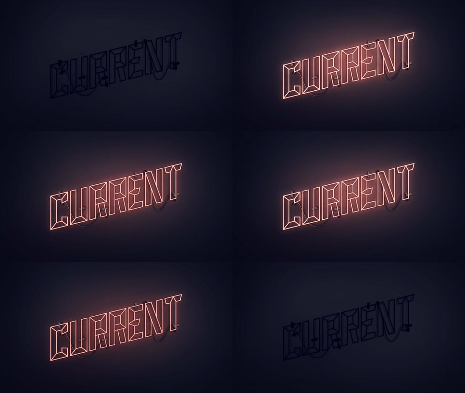
Opened in 2018 at Carolina Square in Chapel Hill, North Carolina, CURRENT ARTSPACE+STUDIO is Carolina Performing Arts new unrestricted arts lab.
Working with the team at Rivers Agency, I developed names, branding, design thinking, wireframes, copywriting, and video direction.
Domicile Properties Rebrand /
I’m just wrapping up my rebrand of San Francisco real estate group Domicile Properties. I think it’s smart, fresh, and free of the dry, overblown elegance that plagues the graphic design in this industry — most of it stinks of a previous generation. The redesign of the website was well-served by the owners; who had faith I could create something appropriate to the category of real estate without rehashing the same tired approaches.
Domicile properties, in partnership with Compass.
Stunning New Naturalist Invitation Designs by Melissa Constandsé /
A mix of romance and innovation is on glorious display in this just-launched invitation suite, the Open Sea Collection. Graphic design can be so caught up in its category these days, but these designs powerfully redefine the expectation of what a wedding invitation can be.
Possessed of dazzling color palettes, crisp typography, and an elegant naturalism, these floral-inspired suites are classic masterpieces.
Brand Launch: La Milpa de Rosa Disrupts /
For the best Mexican chefs, La Milpa de Rosa is New York’s beloved little secret.
Natural, traditional, passionate
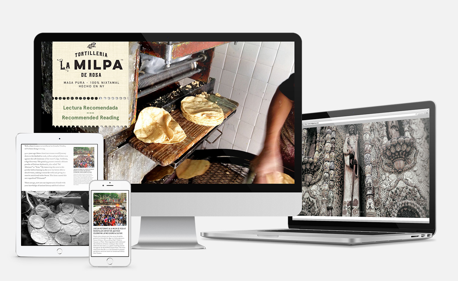
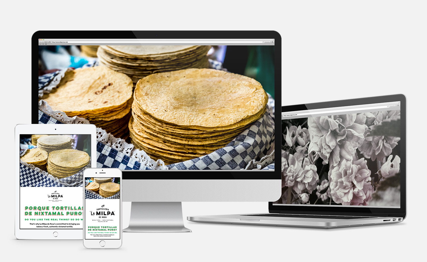
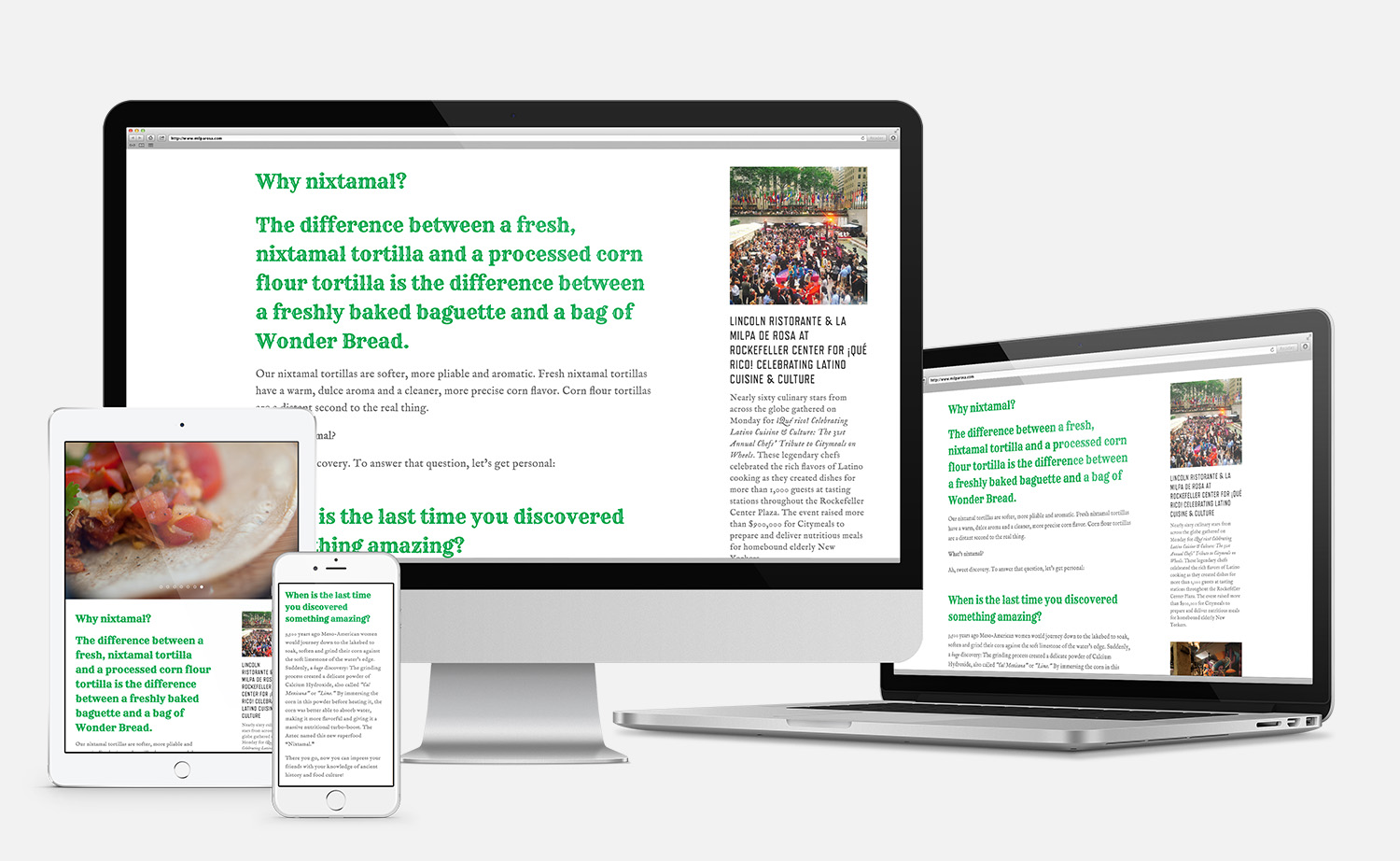
It’s been both fun and delicious learning from the sweet people behind Tortilleria La Milpa de Rosa. Though the secret is really the quality of their masa, not the branding, it’s still a great example of the benefits that come with branding from the bottom up: Everything's in sync, from the name to the frame. Here's a look at the new website.
